Friday, 24 November 2017
Wednesday, 15 November 2017
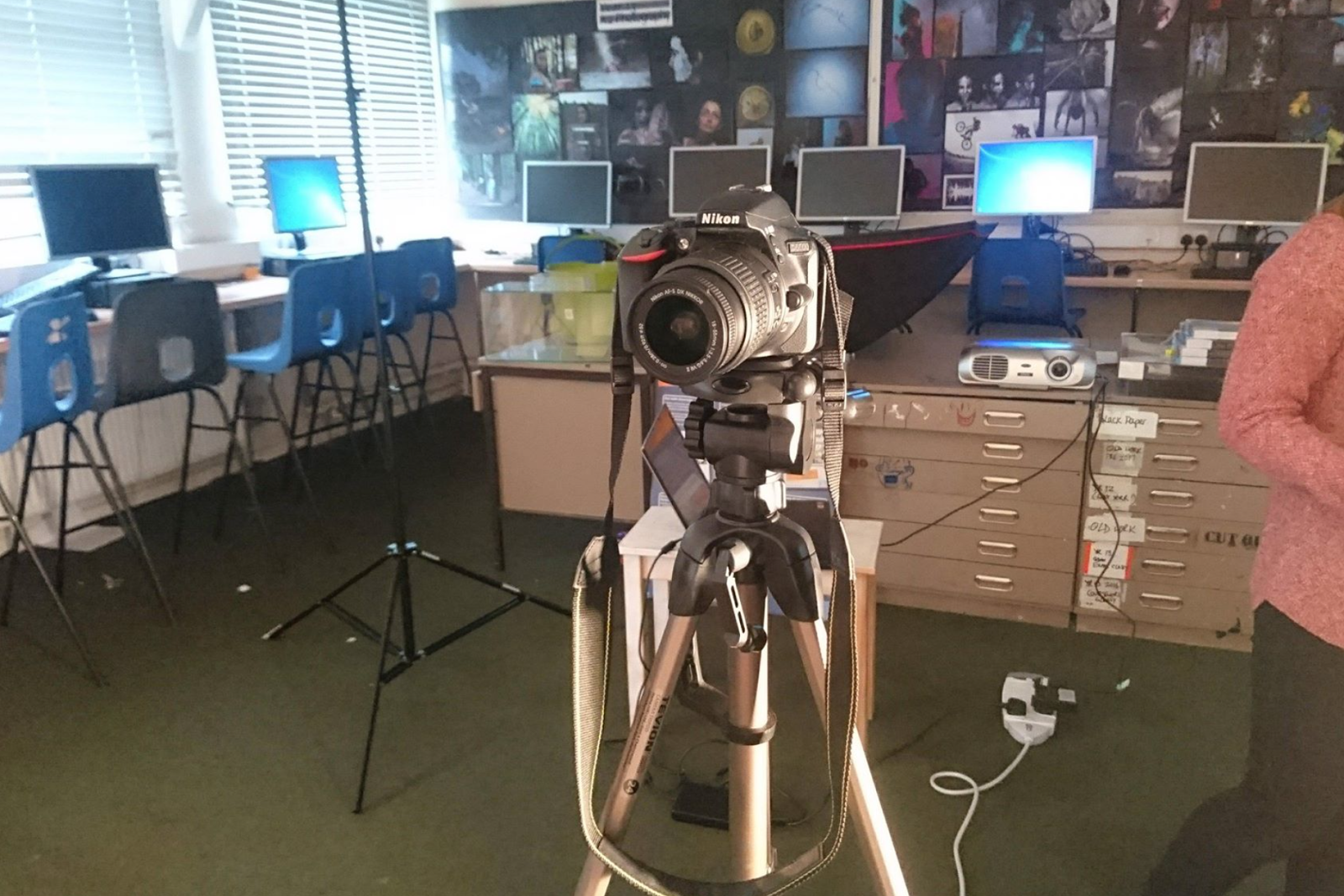
Filming: Day One - The Studio
Filming Prep:
To ensure we were more prepared, Emma and I made lists to keep track of the props, costume and equipment, as well as who was in charge of it. This allowed us to share out all of the items without over loading one person.


Costume:


We also had Sam wear a white T-shirt, as this is best for viewing colours, and the projector images on.
Set Up:


The filters we used:
 |
| Coloured Gel filters, borrowed from the school |
Filters On Our Model:
Below are the photos we took of our performance model, Sam. We tested all the light filters to see which ones had strong colour and worked well with the camera. Over all, Emma and i preferred the dark reds and oranges, as well as dark blues and purples.

Filters On The Set:

A Few Examples Of Raw Footage:
Tuesday, 14 November 2017
Task 23: Branding
Logo Inspiration:
I looked at a few popular indie bands / indie rock bands and attempted to find a few common conventions/idea that I would be able to use when making my brand logo. After a bit of research, I found a few band logos.

When looking at the Marooned logo, I really took a liking to the scruffy font and how it stands out against the black background. It certainly gives off a rock vibe and when comparing this font to my chosen font, you can see a few similarities.
 I really like the black circle around the Arctic Monkeys. It makes the font stand out but it also gives it a smooth shape and fully completes the logo. This is something I would attempt to do with my logo as I like the idea of having my font more prominent from a black background.

And finally, the thing I like about Bastille's logo is the A that has been replaced with a triangle. This, while still looking aesthetically pleasing, promotes the indie pop/rock genre that their music fits into.
Creating My Own logo:
Other final products:


I really love the look of this logo. It's circular shape gives it a pleasing shape that is soft and will stand out against any album cover. I also love the white curved line that cuts across the black background, giving the impression of the rising sun, which links to the name as it is before dawn. Lastly, I make the font transparent. I did this because I like the idea of the text always being the same colour as the album cover. For example, if the cover was multicoloured, the logo would capture all these colours and stand out. It also offers variation as the colour/design of the font will always be different.
I looked at a few popular indie bands / indie rock bands and attempted to find a few common conventions/idea that I would be able to use when making my brand logo. After a bit of research, I found a few band logos.

When looking at the Marooned logo, I really took a liking to the scruffy font and how it stands out against the black background. It certainly gives off a rock vibe and when comparing this font to my chosen font, you can see a few similarities.
And finally, the thing I like about Bastille's logo is the A that has been replaced with a triangle. This, while still looking aesthetically pleasing, promotes the indie pop/rock genre that their music fits into.
Creating My Own logo:
Other final products:


My Final Brand Logo:
I really love the look of this logo. It's circular shape gives it a pleasing shape that is soft and will stand out against any album cover. I also love the white curved line that cuts across the black background, giving the impression of the rising sun, which links to the name as it is before dawn. Lastly, I make the font transparent. I did this because I like the idea of the text always being the same colour as the album cover. For example, if the cover was multicoloured, the logo would capture all these colours and stand out. It also offers variation as the colour/design of the font will always be different.


Skeleton Layout For Our Video
Skeleton from Charlotte Bancroft on Vimeo.
We created a simple skeleton of our video, with the correct shot timings just so we could see how it would turn out and it will be easy to put our footage into.
We created a simple skeleton of our video, with the correct shot timings just so we could see how it would turn out and it will be easy to put our footage into.


Wednesday, 8 November 2017
Actors and Actresses:
Character Profiles:

Reasoning for choosing these actors:
- Protagonist: Charlie Woolf
- For the main protagonist we have specifically chosen Charlie because he is confident in front of the camera. Although, his face may not be seen due to the mask, we still feel as though it is important that the actor feels comfortable being films. In addition to this we feel as though because of the mask, body language may need to be exaggerated to show emotion. This is something Charlie will be able to accomplish to a high standard because of his experience performing in drama plays.
- Female character: Beth Davies
- For the female character we have chosen Beth Davies. This is because she is comfortable being filmed due to previous experience with modelling for photography students. Although she hasn't had any experience acting, because of the mask she wears and the fact that she isn't the main character we feel as though this may not be as noticeable. As well as being a suitable advocate in terms of her confidence she also provides our video with ethnic diversity which we may be able to link to various media theorists and theories. In addition to this, Charlie and Beth know each other outside of filming meaning that they will give a convincing performance in terms of their relationship.
- Performing artist: Sam Grotzke
- We chose Sam Grotzke mainly because his look fits the alternative genre of our song. He owns lots of clothing which would be suitable for the performing artists costume and is willing to wear it for the role. In addition to this he already knows the song and likes the band meaning he will be able to lip sync the words and sing them confidently and enthusiastically. Sam like Beth has also modelled fro photography students meaning he will also feel confident in front of the camera. Although he is not friends with the other actors we found this an unimportant aspect because Sam will mostly feature in scenes alone.
- Male robber: Sam Grotzke
- For the theft scene we have picked Sam to perform as the "villain". This is because he knows the other actors meaning that not only will he give a convincing performance, he will also be comfortable and enjoy performing with the other actors. Also, by using the same actor to perform as the artist and villain we are able to link the performance and narrative halves of the video together. It also creates an enigma code for the narrative based half of the video.
Analysis Of Original Video
Camera:
Throughout the video a range of camera movements are used. Zooms are used repeatedly on the artist to illustrate his importance as the singer and song writer and also his role as the main protagonist. Most of the video also seems to be filmed off tripod creating a psychedelic feel to the video which is illustrative of the music he plays. We felt as though this use of camera was effective as it did enable the concept based half of the video to appear more interesting.
Editing:
Jump cuts are used on the protagonist to show his disorientated state. This reinforces the artists brand identity which we felt was important to demonstrate in the video because it allows the audience to interpret the artist in a way which is appealing to them. One of the elements of editing which was not achieved to the same level was the pace of cuts. In places the cuts felt too rhythmic which is not a convention of the genre or illustrative of the artists music. Pace of cuts is something we will have to pay close attention to when editing our own video.
Lighting:
One of the things we liked most about the lighting was the use of a light projector in the performance based half of the video. The projector helped make what could have been a less interesting half of the video up to the same quality as the concept based half.
Mise en scene:
The unusual costumes used in the video helped to make the video retable. A lot of the dancers/ actors in the video are seen wearing work clothes which allows an audience to identify the characters and find comedic value in their dancing. The use of props also helped make the video interesting, for example the barbie doll dressed in an army uniform. It could be argued that this subtly adds a deeper meaning to the video however, we think that its main purpose like the rest of the video was to appear unusual and confuse viewers into watching more. This technique seemed to work well as the video has gained over 50 million views; a lot for an artist which was not known a year ago. Therefore, this uniqueness is something we would like to include in our own video.
Concept/ performance based:
The use of both forms of video with cross cutting between the two created a great narrator - character feel to the video. However, based on the lyrics we think that the video could have explored the lyrics deeper and created a more meaningful narrative rather than a comedic concept. However, saying that the lighthearted concept behind the video allowed the video to express the songs entire meaning; to relax.
Tuesday, 7 November 2017
Testing out The Projector
In This video I test out my projector and what it looks like on a persons face (a technique we are going to use in our video). This is because the original video inspired us with their projector performance, and we wanted to make our performance more interesting. Before filming, I wanted to learn how to properly use the projector so less time would be wasted by trying to figure it all out.
Considering the projector's age, the quality is very good, however, it is a little pixelly, but this is hard to avoid as it is to do with the technology and how it projects images.
Over all, I believe if done efficiently, our use of the projector during our performance will be brilliant.
Monday, 6 November 2017
Task 21: StoryBoarding
StoryBoard:


What Have I Learnt?
I have learnt that by having a storyboard, It is easier to film. This is because there is a pre-planned and structured guide. Storyboards also allow me to visualise a image, and then bring it to life when filming. However, it is hard to stick to a storyboard as there are moments of random inspiration and moment where things don't go to plan, or the idea changes.
Friday, 3 November 2017
Advanced Edits and cuts:
Editing Techniques:
Cuts from Charlotte Bancroft on Vimeo.
What Went Well:
- The editing techniques were interesting and required different levels of skill to edit, e.g, the text message animation took a lot of time and editing on other applications (Adobe After Effects).
- The spin from one outfit into another worked better than first anticipated - It is almost a seamless transition, however, small details such as positioning while spinning are slightly noticeable.
- Match on action shots are smooth, e.g, bringing hands to face to move hair for the next shot. It matched perfectly, and improved continuity.
- Range of shots e.g, close ups, wide shots, over shoulder shots, angled shots e.c.t
- Considering this whole thing was filmed by one person, things such as lighting, object positioning and camera angling, the footage turned out well.
What Could Be Improved:
- Slight continuity errors: The hair flip shot + Changing Make up shot - Due to filming this on my own, I would have to start the camera on my own, do make up on my own and try to position myself of my own. Also my camera can only record for short periods of time meaning I couldn't record while changing hair/make up, meaning continuity was harder to sustain as I would have to constantly get up to start and stop the camera, which made my positioning change slightly for the hair flip. If perhaps I had more people to help, I would have been easier to keep continuity.
- Lighting: over time lighting begins to shift slightly - this is because it took a few hours to film + re-shoots. The natural lighting provided when I first started filming disappeared and I had to turn on my room light in order to keep things well lit.
- Focusing: Some shots are more in focus than others - I had to focus that camera before I started filming but this was without me being in the shot, so as I entered the shot the focus would shift.
Subscribe to:
Posts (Atom)