Showing posts with label Research. Show all posts
Showing posts with label Research. Show all posts
Friday, 24 November 2017

Tuesday, 14 November 2017
Task 23: Branding
Logo Inspiration:
I looked at a few popular indie bands / indie rock bands and attempted to find a few common conventions/idea that I would be able to use when making my brand logo. After a bit of research, I found a few band logos.

When looking at the Marooned logo, I really took a liking to the scruffy font and how it stands out against the black background. It certainly gives off a rock vibe and when comparing this font to my chosen font, you can see a few similarities.
 I really like the black circle around the Arctic Monkeys. It makes the font stand out but it also gives it a smooth shape and fully completes the logo. This is something I would attempt to do with my logo as I like the idea of having my font more prominent from a black background.

And finally, the thing I like about Bastille's logo is the A that has been replaced with a triangle. This, while still looking aesthetically pleasing, promotes the indie pop/rock genre that their music fits into.
Creating My Own logo:
Other final products:


I really love the look of this logo. It's circular shape gives it a pleasing shape that is soft and will stand out against any album cover. I also love the white curved line that cuts across the black background, giving the impression of the rising sun, which links to the name as it is before dawn. Lastly, I make the font transparent. I did this because I like the idea of the text always being the same colour as the album cover. For example, if the cover was multicoloured, the logo would capture all these colours and stand out. It also offers variation as the colour/design of the font will always be different.
I looked at a few popular indie bands / indie rock bands and attempted to find a few common conventions/idea that I would be able to use when making my brand logo. After a bit of research, I found a few band logos.

When looking at the Marooned logo, I really took a liking to the scruffy font and how it stands out against the black background. It certainly gives off a rock vibe and when comparing this font to my chosen font, you can see a few similarities.

And finally, the thing I like about Bastille's logo is the A that has been replaced with a triangle. This, while still looking aesthetically pleasing, promotes the indie pop/rock genre that their music fits into.
Creating My Own logo:
Other final products:


My Final Brand Logo:

I really love the look of this logo. It's circular shape gives it a pleasing shape that is soft and will stand out against any album cover. I also love the white curved line that cuts across the black background, giving the impression of the rising sun, which links to the name as it is before dawn. Lastly, I make the font transparent. I did this because I like the idea of the text always being the same colour as the album cover. For example, if the cover was multicoloured, the logo would capture all these colours and stand out. It also offers variation as the colour/design of the font will always be different.
Wednesday, 8 November 2017
Analysis Of Original Video
Camera:
Throughout the video a range of camera movements are used. Zooms are used repeatedly on the artist to illustrate his importance as the singer and song writer and also his role as the main protagonist. Most of the video also seems to be filmed off tripod creating a psychedelic feel to the video which is illustrative of the music he plays. We felt as though this use of camera was effective as it did enable the concept based half of the video to appear more interesting.
Editing:
Jump cuts are used on the protagonist to show his disorientated state. This reinforces the artists brand identity which we felt was important to demonstrate in the video because it allows the audience to interpret the artist in a way which is appealing to them. One of the elements of editing which was not achieved to the same level was the pace of cuts. In places the cuts felt too rhythmic which is not a convention of the genre or illustrative of the artists music. Pace of cuts is something we will have to pay close attention to when editing our own video.
Lighting:
One of the things we liked most about the lighting was the use of a light projector in the performance based half of the video. The projector helped make what could have been a less interesting half of the video up to the same quality as the concept based half.
Mise en scene:
The unusual costumes used in the video helped to make the video retable. A lot of the dancers/ actors in the video are seen wearing work clothes which allows an audience to identify the characters and find comedic value in their dancing. The use of props also helped make the video interesting, for example the barbie doll dressed in an army uniform. It could be argued that this subtly adds a deeper meaning to the video however, we think that its main purpose like the rest of the video was to appear unusual and confuse viewers into watching more. This technique seemed to work well as the video has gained over 50 million views; a lot for an artist which was not known a year ago. Therefore, this uniqueness is something we would like to include in our own video.
Concept/ performance based:
The use of both forms of video with cross cutting between the two created a great narrator - character feel to the video. However, based on the lyrics we think that the video could have explored the lyrics deeper and created a more meaningful narrative rather than a comedic concept. However, saying that the lighthearted concept behind the video allowed the video to express the songs entire meaning; to relax.
Throughout the video a range of camera movements are used. Zooms are used repeatedly on the artist to illustrate his importance as the singer and song writer and also his role as the main protagonist. Most of the video also seems to be filmed off tripod creating a psychedelic feel to the video which is illustrative of the music he plays. We felt as though this use of camera was effective as it did enable the concept based half of the video to appear more interesting.
Editing:
Jump cuts are used on the protagonist to show his disorientated state. This reinforces the artists brand identity which we felt was important to demonstrate in the video because it allows the audience to interpret the artist in a way which is appealing to them. One of the elements of editing which was not achieved to the same level was the pace of cuts. In places the cuts felt too rhythmic which is not a convention of the genre or illustrative of the artists music. Pace of cuts is something we will have to pay close attention to when editing our own video.
Lighting:
One of the things we liked most about the lighting was the use of a light projector in the performance based half of the video. The projector helped make what could have been a less interesting half of the video up to the same quality as the concept based half.
Mise en scene:
The unusual costumes used in the video helped to make the video retable. A lot of the dancers/ actors in the video are seen wearing work clothes which allows an audience to identify the characters and find comedic value in their dancing. The use of props also helped make the video interesting, for example the barbie doll dressed in an army uniform. It could be argued that this subtly adds a deeper meaning to the video however, we think that its main purpose like the rest of the video was to appear unusual and confuse viewers into watching more. This technique seemed to work well as the video has gained over 50 million views; a lot for an artist which was not known a year ago. Therefore, this uniqueness is something we would like to include in our own video.
Concept/ performance based:
The use of both forms of video with cross cutting between the two created a great narrator - character feel to the video. However, based on the lyrics we think that the video could have explored the lyrics deeper and created a more meaningful narrative rather than a comedic concept. However, saying that the lighthearted concept behind the video allowed the video to express the songs entire meaning; to relax.
Friday, 3 November 2017
Advanced Edits and cuts:
Editing Techniques:
Cuts from Charlotte Bancroft on Vimeo.
What Went Well:
- The editing techniques were interesting and required different levels of skill to edit, e.g, the text message animation took a lot of time and editing on other applications (Adobe After Effects).
- The spin from one outfit into another worked better than first anticipated - It is almost a seamless transition, however, small details such as positioning while spinning are slightly noticeable.
- Match on action shots are smooth, e.g, bringing hands to face to move hair for the next shot. It matched perfectly, and improved continuity.
- Range of shots e.g, close ups, wide shots, over shoulder shots, angled shots e.c.t
- Considering this whole thing was filmed by one person, things such as lighting, object positioning and camera angling, the footage turned out well.
What Could Be Improved:
- Slight continuity errors: The hair flip shot + Changing Make up shot - Due to filming this on my own, I would have to start the camera on my own, do make up on my own and try to position myself of my own. Also my camera can only record for short periods of time meaning I couldn't record while changing hair/make up, meaning continuity was harder to sustain as I would have to constantly get up to start and stop the camera, which made my positioning change slightly for the hair flip. If perhaps I had more people to help, I would have been easier to keep continuity.
- Lighting: over time lighting begins to shift slightly - this is because it took a few hours to film + re-shoots. The natural lighting provided when I first started filming disappeared and I had to turn on my room light in order to keep things well lit.
- Focusing: Some shots are more in focus than others - I had to focus that camera before I started filming but this was without me being in the shot, so as I entered the shot the focus would shift.
Tuesday, 17 October 2017
Monday, 16 October 2017
Task 17: Lyric Analysis

What Have I Learnt?
From this I have learnt that despite sounding random and crazy upon the first listen, Feel It Still actually has a deeper meaning to it that is hidden in the lyrics. There are plenty or references to freedom, as well as references to the lead singers daughter.
Friday, 13 October 2017
Task 16: Genre Research
The Killers: Mr Brightside


Foster The People: Pumped Up Kicks

What Have I Learnt?
From this I have learnt the common genres of indie/rock. This will make it easier to make my video as I can follow a few of the conventions. By examining other conventions, I could potentially challenge a few of them, however, this could cause genre complications and or give people the wrong impression of the video and song, as it would be a huge juxtaposition.
Tuesday, 10 October 2017
Task 15: Artist, Video, Lyrics, Permission
Our Chosen Song:


Lyrics:


Asking For Permission:

About The Band:

What Have I Learnt?
From this I have learnt a lot more about the band itself. By knowing the band its slightly easier to understand where the "vibe" of the song originated from. I have also learnt that copy rights/permissions is very important, otherwise we could face a potential fine / copy right claim.
Monday, 9 October 2017
Task 14: Thinking Of A Concept
What Have I Learnt?
From this I have learnt that I have leaned towards a specific genre - indie. This is because the lyrics have meaning to them and I find it easier to picture how I would want my video to turn out as. With a visual picture in mind, It makes it more easier to bring my vision to life, as long as it is simple to do and within budget.
Saturday, 7 October 2017
Task 13: Editing Techniques
Filming this small scene was very time consuming and attention to detail is key. We had to make sure our actors were always in the same spot - we did this by centring them and using a tape measure to make sure they were always the same distance from the camera.
However, continuity in this clip was extremely hard to achieve as there were lighting changes, wind effected hair, and the actors would do different things with their arms which they didn't do in the next shot. This makes it slightly hard to watch without noticing these continuity errors.
What Have I Learnt?
From this I have learnt that continuity is very important. The audience will notice small details that don't add up, and that will really take away from the viewing experience. It also gives the impression that there was no effort in trying to make sure the video linked up.
Friday, 22 September 2017
Analysing Record Covers
While digging through my attic, I stumbled across mountains of records, some of which date back to the 1960's. When looking at these old records, you can see similarities between records and digipaks, and how digipaks have evolved from record covers.
This record sleeve for Iron Maiden is very interstice as instead of having photos of the artist, it is a cartoon design with implications of death and dark themes.
 |
| Record sleeve |

Something else I noticed on the back of most albums was that they often contained little facts or comments from the artist or band. For example, on the back of Madness, each song has a comment from one of the members, explaining how the song originated. This gives the album more use, as well as allowing their audience to know the back story to their songs. When speaking to my father about this, he commented that he feels that he is in an "exclusive" group as not many people will know of these facts as they do not have the album.

When records were all the range, most record creators were aware that their target audience was young people. Therefore they tried to more directly pander to them, while offering help and advice. For example, this album is advertising childline, something that most CDs/Digipaks do not do anymore. This is a interesting feature as it shows that in the past there was a focus on protecting their listeners, where as now, in the present, most producers are interested in how to sell their products instead of the audience's wellbeing.

Monday, 18 September 2017
Editing Lip-Syncing:
Lip-syncing is one of the most important features in a music video. Producers aim to make it look like the singer is singing right then and there, not that music is edited over. So, to make it as realistic as possible, lip syncing needs to be spot on, otherwise there will be a slight delay in lip movements and music lyrics. This small mistake has a huge impact on the video as it makes it look less realistic and the audience will notice the delay, and this will stop them from being fully immersed in the video.
However, by tweaking the speed of the footage by 1-2%, I was able to bring the video up to speed with the song. But, there are a few moments when the song doesn't sync with the footage, and this is because my friend briefly forgot the lyrics and stuttered. Down below is the "fixed" version.
fixed lip sync from Charlotte Bancroft on Vimeo.
Making it interesting:
Music videos rarely have large chunks of the artist lip syncing. This is because it is pretty boring to watch and the audience loses interest. To prevent this, the performance is usual split up by narrative footage or a different shot of the artist singing. Since I have no narrative footage to work with yet, I edited different angles of my friend lip syncing together.
Lip sync cuts from Charlotte Bancroft on Vimeo.
There are a few lip sync errors in a few of the clips, but it makes the clip slightly more interesting than a solid 10 seconds of one lip-syncing clip.
In order to try and prevent this when I attempt to make my music video, I have decided to try to get some extra practice in and test a few different editing techniques.
Accuracy:
I attempted to keep the lip syncing as synced up as I could by using a few techniques when filming and when editing:
During filming I would play the song aloud, through my laptop. This allowed my friend to hear the pace of the song and be able to keep up with the lyrics. I also tried my best to countdown toward the start of the chorus so my friend would know when to prepare herself so she didn't miss the start of the chorus. I took many videos, so I had more footage to work with. This is because with more footage, there would be more of a chance of having a good lip sync.
During editing I would go through the usual routine of trying to match the section of footage up with the correct section of music. After roughly matching the music and video, I would keep my eyes peeled so I could notice any errors within the clip and the music. Down below is a clip of a bad lip sync, where there are points throughout the video where the song and footage don't match. The video is slightly slower than the audio.
Bad lip sync from Charlotte Bancroft on Vimeo.However, by tweaking the speed of the footage by 1-2%, I was able to bring the video up to speed with the song. But, there are a few moments when the song doesn't sync with the footage, and this is because my friend briefly forgot the lyrics and stuttered. Down below is the "fixed" version.
fixed lip sync from Charlotte Bancroft on Vimeo.
Making it interesting:
Music videos rarely have large chunks of the artist lip syncing. This is because it is pretty boring to watch and the audience loses interest. To prevent this, the performance is usual split up by narrative footage or a different shot of the artist singing. Since I have no narrative footage to work with yet, I edited different angles of my friend lip syncing together.
Lip sync cuts from Charlotte Bancroft on Vimeo.
There are a few lip sync errors in a few of the clips, but it makes the clip slightly more interesting than a solid 10 seconds of one lip-syncing clip.
Testing Different Lens:
Using different camera Lens:
Most producers will either add filter over the top of a music video, or use a small lens disk to change the lighting, colour or contrast of the footage filmed. However, I wondered if using lens' actually made a huge difference to the footage. The first lens I tested out is the warming lens. It is supposed to make light more soft and warm. Down below in the original photo. Sarah's face is very red and you can see shine reflecting off her chin and cheek area.
 |
| Without Lens Filter |
The photo below is the photo I took with the warming lens. Over all, Sarah's face looks slightly smoother as there is less shine. The over all lighting of the room looks a lot darker that the image above, showing that the lens has clearly changed the lighting of the room. I believe that during filming I will use the filming lens. This is because it makes lighting less harsh and makes objects in the footage a whole lot softer and smooth.
 |
| With Lens Filter |
Saturday, 1 July 2017
Re-Creating A Digipak Advert In a Different Genre
Since one of my final projects requires an advert for my digipak, I decided to re-make/convert an Olly Murs advert into a advert that reflected the indie genre, so I have an idea of what to expect when I make my own advert. Overall, the indie genre is usually quite basic when it comes to advertising. It has the basic information people need to know, along side a photo of the artist/band, and or their logo or something that represents them.
 |
| Original |
 |
| My re-make in indie genre |
How I created This:
First I started with a image of my model stood in front of a projected background and stretched it to the proportions that I wanted.

The rest was simple, I added my text, change the text size, colour and font and made it slightly opaque so it blended into the background better. However, I did have to rub a small bit of text out so it looked like Sam was in front of the text.

I then added the website link at the bottom so it would fit the conventions.
What Have I Learnt?
From this I have learned to be slightly more confident with photoshop and creating things that represent the indie genre. This will help me with my advert as I know the conventions of indie, and I'll be able to use them when creating a digipak and a poster.
Friday, 30 June 2017
Task 11/12: Photoshoot and Re-make of an Album
Panic! At The Disco Album Remake:
Original Album:

My Remake:

How Did I Remake This Album?


Original Album:

My Remake:
How Did I Remake This Album?
- Firstly, I started by having a photoshoot of my friend. I had him pose similar to the pose of Brendon, then using the camera on my phone, I took a few photos. In the end, I ended up using this photo as my base:

- I took this photo and using the lasso tool on photoshop, I cut my friend out of the photo and and onto a blank background. I then went onto google images to try and find a high quality photo of a desert with buildings in the background. However, I could not find a background that was similar to the original album. Because of this, I had to create my own background. I used a image of a desert and a .PNG of some buildings in order to photoshop the buildings into the distance of the desert photo. To do this, I edited the buildings so they are small and semi-opaque. I then used the liquidfication tool too take the sharpness out of the corners of the buildings and to try and blend the base of the buildings with the floor of the desert. In the end I ended up with this photo:

- I then photoshopped my background with my base image in order to make it look like Kieran was in the background. I then added a few filters and effects in order to get the dull grey colour.


- The hardest part of re-creating this album was the rainbow smoke that is seen coming from Brendon's cigarette. At first I struggled to re-create this as I tried to colour in a .png of smoke. However, I soon discovered that it would be easier to create a rainbow layer and merge it with the smoke.

- I used the lasso tool to cut out the smoke and then I proceeded to add a feather effect to the edges of the smoke so it looked more natural and smoke like, instead of a sharp cut.
What Have I Learnt?
From this I have learnt a few new photoshop skills. I feel slightly more confident making my digipak as it will be my own work, I won't have to re-create anything.
Thursday, 29 June 2017
Task 10: 30 Cut Chorus
Justin Bieber 30 cut chorus:
What Went Well?
- Range of shots - There are many examples of different types of camera shots and angles, for example there are close ups, long shots and pans. These camera angles reflect my group's confidence with exploring new camera angles, whilst making our sequence more professional and varied.
- Editing Techniques - While editing our footages, we had to make sure the cuts lined up with the beat of the music. In order to do this successfully, we created markings on each beat and cut our footage so it was able to fit with the beat. My group also tried to incorporate a few jump cuts into our sequence to further show our editing skills. As well as jump cuts, my group managed to successfully create match on action shots. Over all, this makes our sequence flow smoothly.
- Continuity - While filming this sequence, one of our worries was lack of continuity as there were several shots where I would change my hand positioning and my bag kept falling off my shoulders. However, we managed to fix this during editing by selecting sets of footage that linked up, and had minimal continuity errors.
- Team Work - During this task we all decided to have a certain task or part to play. For example, we would rotate who would direct, who would film and who would edit the footage. Over all this shows that a joint effort from a team is extremely useful when creating small projects.
What Didn't Go Well?
- Jump cuts - Despite the fact that we attempted to add some high class editing techniques into our sequence, the jump cuts look slightly rough and looks like huge gaps are missing from the footage. This makes the sequence less professional and stops the sequence from flowing smoothly.
- Filming - During filming, we ran out of time to fully film our sequence in the time given. This was slightly irritating as it meant we had to wear the same outfit and make up/hair again the next day. We also had to wait until the weather was similar to the weather on the first day of filming as we wanted to keep continuity errors and a minimum.
- Differentiation of shots:
What Have I Learnt?
From this task I have learnt that during sequences of shot cuts, continuity is very important to the process. This is because the audience can pick out small details that have changed during the sequence. This then gives a negative impression as it makes it seem that the project was done lazily and the project was not properly directed or cared for. If I were to incorporate these techniques into my music video, I now know that extra care has to be done in editing to ensure that everything flows smoothly.
Wednesday, 28 June 2017
Task 9: Lip Syncing Task
Learning comment:
I think that overall, our project went well. We worked well as a team and showed lots of variation and fun ideas in our clip. We took advantage of our surroundings and used lots of locations, as well and involving everyone in the clip. The lip syncing was done really well and was edited to the music correctly, making the overall quality much better. However, some clips are slightly delayed so you can see the person standing around before they start dancing. Also, we ran out of footage as we kept losing track of the song, meaning we had to edit in some old footage in order to fill some of the gaps. I believe this could have been avoided if we made a plan instead of spontaneously going out to film and randomly filming on the spot, which is time consuming and very hard to do.
Tuesday, 20 June 2017
Task 8: Audience Research & Music Consumption
I asked 4 friends; 2 female and 2 male about their music video opinions and preferences. Down below are their responses.
Alice: Age 17, Female


Darren: 46, Male:


Charlie: 17, Male:


Task 2: Theoretical Analysis.
Task 3:
* In Progress*
Sunday, 18 June 2017
Task 7: Music Video Analysis
Task 1:


Why I chose these videos:
Other that the videos being three different genres, I chose the videos I chose because they all have different elements. For example, Maroon 5 has lots of small details and mise en scene in oder to produce an effective storyline and narrative for the video. This makes the video so much more entertaining to watch as well as supporting a strong narrative. I also chose the Panic! song because it used a very uncommon and interesting camera shot. I haven't seen many POV camera angles so it was very interesting to analyse. Lastly, I chose a K-pop song, despite having no interest or liking towards the genre because K-pop is extremely well known for it's amazing editing techniques and small and strange details. By analysing all these videos, I am am able to make links between videos, for example, they all use close up or low shots to show power, and i am also able to see how different cultures effect the music video. For example, the Western videos I analysed were very story based and had a narrative surrounding low and murder. However, the K-pop song had lots of strange scenes that weren't 100% relatable to the lyrics, as well as putting more effort into editing techniques and in sync dance moves than it was story driven.
Video links:
K-Pop: Monster Maroon 5: Animals Panic!: DTMWAGT
Task 2:
Task 7 from Charlotte Bancroft on Vimeo.
Task 3:
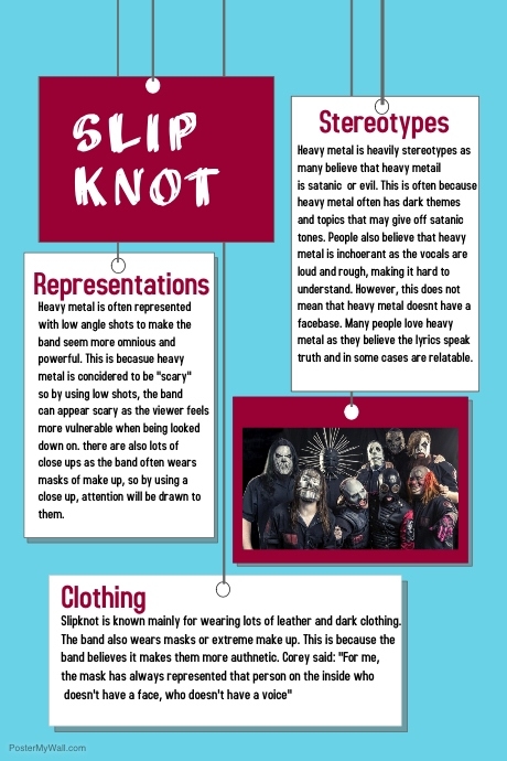
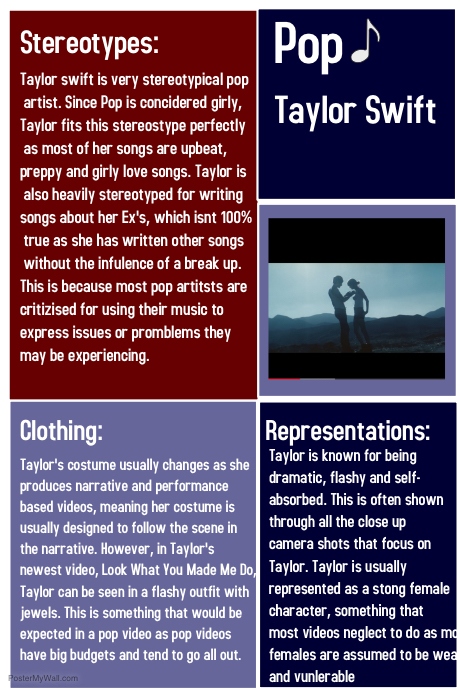
What Have I Learnt?
From this, I have learnt that visuals are very important in a music video. The visuals either tell a short narrative or are performance based and are there for entertainment. By creating a video, it is easier to picture the video/story while listening to the song. After analyzing many different types of music video elements, I think the narrative and performance based narrative may be one of the easiest to film, as well as being the most common type of music video.


Why I chose these videos:
Other that the videos being three different genres, I chose the videos I chose because they all have different elements. For example, Maroon 5 has lots of small details and mise en scene in oder to produce an effective storyline and narrative for the video. This makes the video so much more entertaining to watch as well as supporting a strong narrative. I also chose the Panic! song because it used a very uncommon and interesting camera shot. I haven't seen many POV camera angles so it was very interesting to analyse. Lastly, I chose a K-pop song, despite having no interest or liking towards the genre because K-pop is extremely well known for it's amazing editing techniques and small and strange details. By analysing all these videos, I am am able to make links between videos, for example, they all use close up or low shots to show power, and i am also able to see how different cultures effect the music video. For example, the Western videos I analysed were very story based and had a narrative surrounding low and murder. However, the K-pop song had lots of strange scenes that weren't 100% relatable to the lyrics, as well as putting more effort into editing techniques and in sync dance moves than it was story driven.
Video links:
K-Pop: Monster Maroon 5: Animals Panic!: DTMWAGT
Task 2:
Task 7 from Charlotte Bancroft on Vimeo.
Task 3:
What Have I Learnt?
From this, I have learnt that visuals are very important in a music video. The visuals either tell a short narrative or are performance based and are there for entertainment. By creating a video, it is easier to picture the video/story while listening to the song. After analyzing many different types of music video elements, I think the narrative and performance based narrative may be one of the easiest to film, as well as being the most common type of music video.
Subscribe to:
Posts (Atom)