Wednesday, 31 January 2018

Task 22: Ancillary Tasks - First Digipak Design + Feedback

My Digipac design: 

This is one of the final edits of my digipak


FeedBack:

A friend offered to review my digipak for me so I decided to record his feedback:
DigiPak Feedback from Charlotte Bancroft on Vimeo.

Wednesday, 10 January 2018

Task 22: Ancillary Tasks - Poster


Digipak Poster: 


Final Product:


Over all, my poster is quite basic but is also creative and there are obvious similarities carried across from my digipak. Despite being slightly on the "plain" side, I think this works best for my genre. It is bright and colourful, my artist is wearing clothing that promotes the indie side of the genre, and the scratches give the poster a "dirty/damaged" kind of look.

The Wave Effect: 

One of my favourite ways of distorting an image is by using the wave effect. 

The effect can be found in the filter tab, in the distort tab. 


When clicking wave, It will load this small window. From here you can edit how you "wave" the image. I usually only change the number of generators and the wave length in order to get the perfect distortion. I never go above 15 for number of generators - this is because it distorts the image beyond recognition or scatters the image, and this did not look good. 


Text: 

Name of the album: I wanted the name of the digipak to match the font used on the poster. This is because it makes it easier for my audience to make a link between the digipak and the poster as they share the same font. The font I used is called Hacked. I chose this font because it is similar to my poster/digipak as it features distortion of the text. Other fonts I looked at looked too glitchy (as in technology glitch) and often had numbers or symbols. This is not the effect I am trying to portray. I want my poster to look vintage, like a distorted VHS. 


For the website links/twitter handle I used a simple bold font. This is so it will be easy to see and read. The basic font stick out as it is very simple compared to the poster itself. By making the text stick out, I'm hoping it would draw more attention to the website and twitter hashtag.

Feedback: 

I got some feedback from a friend, however he did not have much criticism to give my poster. This made if harder for me to make changes, however it gave me confidence that it appeals to my audience.
Poster Feedback from Charlotte Bancroft on Vimeo.

I decided to the edit a few things and add extra text to make it seem more like it was advertising a future release:


Thursday, 4 January 2018

Filming: Day Three - The Prison


Here is a mini vlog Emma made throughout the day of filming:


Some Additional Pictures:

In order to get access to the prison we had to pay for entry. This was very pricey, especially when the cost of the train tickets were added into the over all cost. However, the prison was an excellent setting and I believe it was worth the cost. We were able to get many good shots, as well as learning a little bit about prison life!


Filming in the cells were a slight problem. The lighting was a bit dull as the only source of light came from a small and dirty window. At one point we tried using the flashlights on our phones to boost the lighting, however, it made the scene look unnatural.


The prison, despite being decommissioned, abandoned and creepy, was actually very aesthetic! There were warnings pained everywhere, a wall were prisoners carved their names and huge walls that were covered in razor wire, ouch!


This has to be one of my favourite shots. I love the way that Sam contrasts the plain white background, and how the writing is placed next to him in the shot. This would be an amazing digipak cover, however, it does not fit with the work I have already done.


Tuesday, 2 January 2018

Filming: Day Two - Bristol


Filming In Bristol:

Today we headed into Bristol to film the romantic scene between our two characters. Unfortunately the weather was bleak, pretty dull and rainy. This had a few consequences which I will explain later.

Locations:
Firstly we started off by filming in Cabot Circus. Our aim was to get shots of shopping, light hearted fun and some scenic shots. However, within minutes we had to stop filming and leave the premises. This was because the shopping centre has to be careful and be suspicious of photographers as there is belief that anyone could be assessing the shopping centre, picking out weaknesses and planning to attack. The security explained the whole situation and it was completely understandable and perfectly reasonable since we didn't make them aware of our presence beforehand. They checked my camera and assessed the footage just to make sure I wasn't trying to exploit weaknesses in the infrastructure. Luckily they continued to let us film - just as long as it was out of the borders of the shopping centre.


Around Bristol: 

We went to a few places in Bristol - The bridge over the river, the water fountains near @Bristol, and a few of the streets in the area. The weather was awful and this effected both the lighting of the shots, and the moral of the actors + Emma and I. By the end of the day we were desperate to get back home - this caused us to rush filming (as well as having a time limit to get our actor home in time for work) so the footage is not as good as I would have liked.


Wednesday, 15 November 2017

Filming: Day One - The Studio

Filming Prep: 

To ensure we were more prepared, Emma and I made lists to keep track of the props, costume and equipment, as well as who was in charge of it. This allowed us to share out all of the items without  over loading one person.


Costume:


We also had Sam wear a white T-shirt, as this is best for viewing colours, and the projector images on. 


Set Up:

 The Set up from our view - We positioned the camera in the centre of the huge white background and angled the lights.
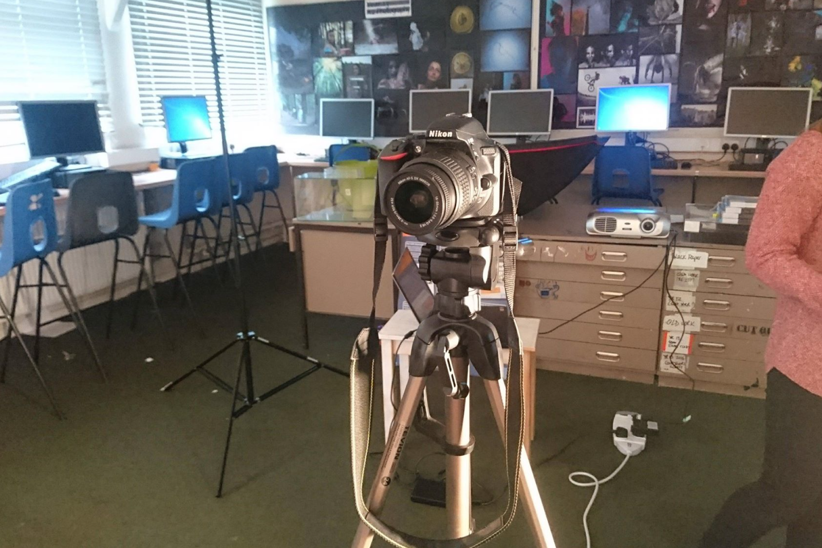
 The set up of the camera/the projector. The camera was placed onto a tripod and was left there at eye level height. The projector was also carefully balanced on the back cabinets, where it was able to shine onto the white screen.


Testing Lights & Filters:

The filters we used:


Coloured Gel filters, borrowed from the school

Filters On Our Model:

Below are the photos we took of our performance model, Sam. We tested all the light filters to see which ones had strong colour and worked well with the camera. Over all, Emma and i preferred the dark reds and oranges, as well as dark blues and purples. 


Filters On The Set:


A Few Examples Of Raw Footage:


Tuesday, 14 November 2017

Task 23: Branding

Logo Inspiration:

I looked at a few popular indie bands / indie rock bands and attempted to find a few common conventions/idea that I would be able to use when making my brand logo. After a bit of research, I found a few band logos.


When looking at the Marooned logo, I really took a liking to the scruffy font and how it stands out against the black background. It certainly gives off a rock vibe and when comparing this font to my chosen font, you can see a few similarities.


 I really like the black circle around the Arctic Monkeys. It makes the font stand out but it also gives it a smooth shape and fully completes the logo. This is something I would attempt to do with my logo as I like the idea of having my font more prominent from a black background.


And finally, the thing I like about Bastille's logo is the A that has been replaced with a triangle. This, while still looking aesthetically pleasing, promotes the indie pop/rock genre that their music fits into.


Creating My Own logo:


Other final products:


My Final Brand Logo: 


I really love the look of this logo. It's circular shape gives it a pleasing shape that is soft and will stand out against any album cover. I also love the white curved line that cuts across the black background, giving the impression of the rising sun, which links to the name as it is before dawn. Lastly, I make the font transparent. I did this because I like the idea of the text always being the same colour as the album cover. For example, if the cover was multicoloured, the logo would capture all these colours and stand out. It also offers variation as the colour/design of the font will always be different.